Web · 2026
Waranex
Practical guidance for everyday decisions, designed like a poster instead of a bank.


The brief
Four everyday decisions, two languages, one honest promise.
Waranex helps people read the papers, see their options and decide for themselves: a credit report that doesn’t add up, a car offer with extra fees, a budget that keeps slipping, a home repair they haven’t faced before.
It doesn’t make the decision for the client. The site had to say that without sounding timid.
- Recognise yourself fast.A visitor should see their own situation in one of four service areas, then send a message or call.
- Spanish is not an afterthought.Spanish-speaking households are a primary audience, so the Spanish site carries the full content.
- Education, not advice.The services are general education and coaching. The disclaimer stays, and nothing promises an outcome.
- No invented proof.No testimonials, client counts or statistics. The writing is the only proof, so it has to be clear.
The idea
Finance usually looks like fine print. This site should look like the explanation.
The people who come to Waranex are about to sign, buy or commit, and the paperwork in front of them is dense. The site has to be the opposite of dense: one clear thing at a time, loud enough to read from across the room.
So it was treated as a poster. Whole bands of the logo’s green, huge navy type, and a headline that is the image. No stock handshakes, no row of small cards, no serif advisor template.
The Green Field Poster
You make the decision. We help you understand what you’re deciding.
The design
Three decisions that make it feel like one thing.
-
Two colours, both from the logo
The logo’s green and navy are fixed, and everything else is derived from them. Green isn’t an accent here. It owns whole bands with navy type on top, so the page feels warm instead of cold or bank-like. Secondary text on green is navy mixed toward the green, never grey.
Field Green#89C335Brand Navy#243143Navy Ink#182130White#FFFFFF -
One typeface, set loud
Archivo, one variable file. Headlines are bold and slightly wide with tight tracking, so scale carries the message. Body text drops back to normal width. Only the three process numerals go heavy and fully expanded.
-
Four drawings, one orbit
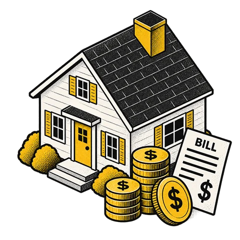
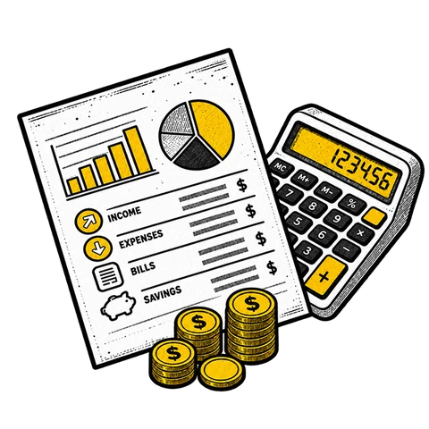
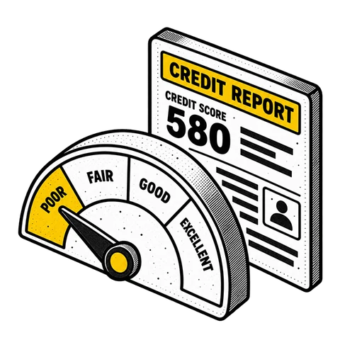
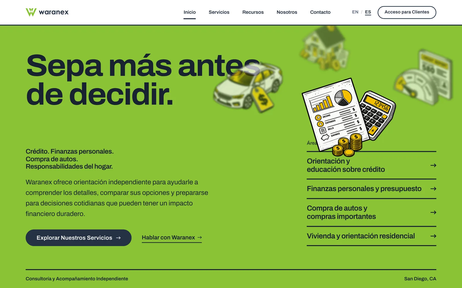
On a wide screen the four service drawings (credit, finance, car and home) travel a large, invisible, tilted ellipse above the service list. One holds the front, then the orbit eases to the next. It is the only authored motion in the hero, and visitors who prefer reduced motion get it held still.
The finished site
What shipped.
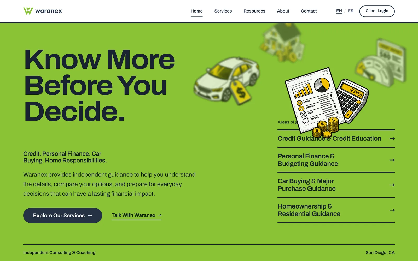
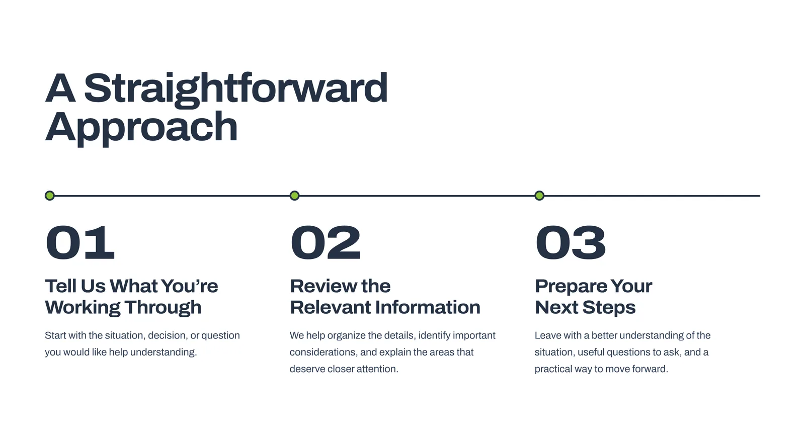
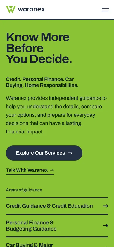
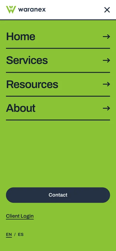
On a phone the orbit is gone, and the menu becomes a full green field.
Two languages
Spanish is a primary audience, not a translation.
Every page exists at / and /es/ with the same design and the full content, and the language switch sits in the header on every page.
The four resource guides (reading a credit report, building a monthly budget, buying a car, the costs of owning a home) are published in both languages.
Know More Before You Decide.
Sepa más antes de decidir.
Under the poster
Simple to run, open to everyone.
- 17static pages, built ahead of time
- 2languages, one design
- 8guide pages: four guides, each in English and Spanish
- 0front-end frameworks
A static Astro site with plain CSS, so it is simple to host and simple to keep up. The contact form is protected against spam, and Client Login opens the separate portal.
Every service is open and readable without JavaScript, the orbit switches off for visitors who prefer reduced motion, and a skip link is the first thing on every page.